
You've got the raw footage, the voiceover, and a script that looked great on paper. Now you're staring at a timeline full of clips and wondering where to start. Editing an explainer video is different from cutting a vlog or a product demo — the goal is to teach something clearly in 60 to 90 seconds, and every cut either helps or hurts that goal.
Start With the Script, Not the Timeline
Before you touch a single clip, open the script in a text editor and mark it up. This is the step most editors skip, and it's the reason their first cut feels messy.
- Number each sentence or idea. A 90-second explainer usually has 12–20 distinct beats.
- Mark the visual for each beat. Write "screen recording," "animation," "talking head," or "text card" next to each line.
- Flag the hook. The first 5–8 seconds need a visual that stops the scroll — usually a problem statement or a bold claim, not a logo animation.
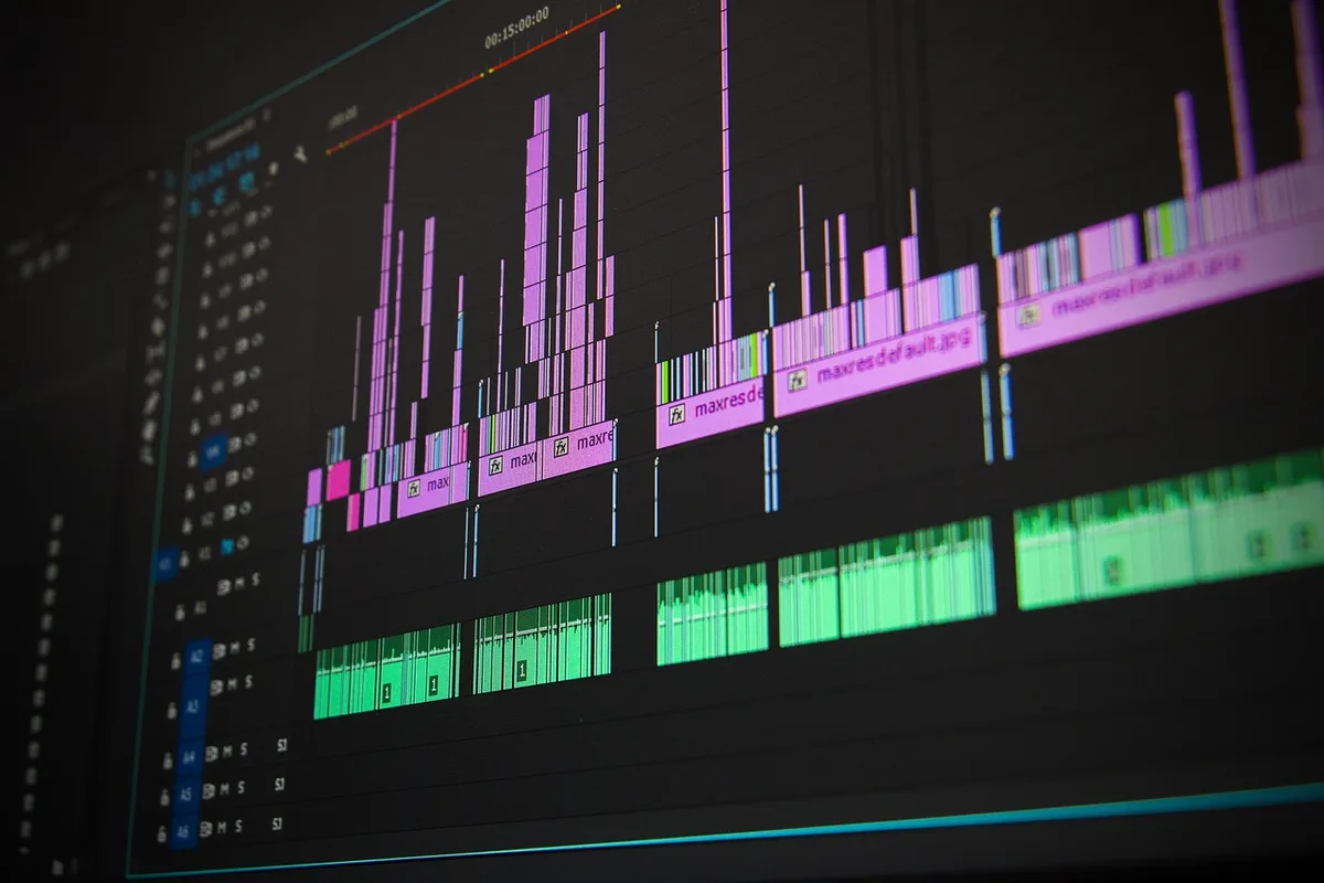
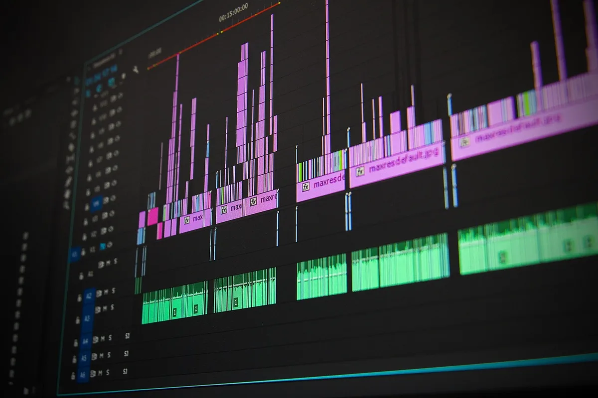
In Premiere Pro or DaVinci Resolve, build your sequence around these beats. Drop the voiceover on A1 first, then lay clips on V1 in script order. This "radio edit" approach — audio first, visuals second — is how professional explainer editors work because it forces you to cut for clarity, not for cool-looking footage.
Cut the Voiceover First (and Cut It Ruthlessly)
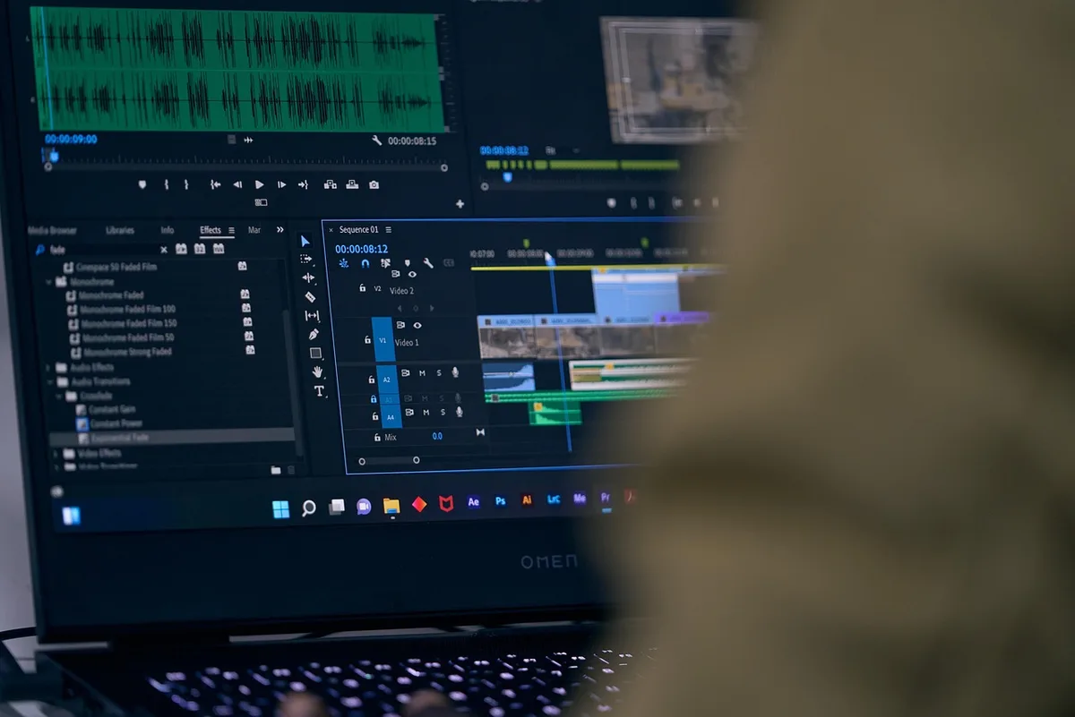
Explainer voiceovers are almost always 15–20% too long on the first pass. Your job is to tighten them before adding any graphics.
- Remove filler words. "Um," "so," "basically," and "actually" add nothing. Use ripple delete (Shift+Delete in Premiere) to close gaps instantly.
- Cut breaths between sentences. Leave 4–6 frames of room, not a full second.
- Kill redundant lines. If the narrator says "Our platform helps you save time" and then "You'll save hours every week," pick one.
- Target 140–160 words per minute. That's a comfortable explainer pace. If your VO is running at 180 wpm, it will feel rushed no matter how good the visuals are.
Once the audio edit is locked, export a reference audio file and use it as your timing master. Every visual you add should sync to a specific word or phrase.
Match Visuals to the Beat, Not the Sentence
A common mistake is showing one visual per sentence. That creates a slideshow feel. Instead, change what's on screen every 2–4 seconds during dense sections, and hold longer on key moments.
- Use the "one idea, one visual" rule. If a sentence contains two concepts, split it into two shots.
- Animate on the keyword. When the narrator says "automate," that's when the gear icon should appear — not two seconds earlier.
- Vary shot types. Alternate between screen recordings, simple motion graphics, and a talking head if you have one. Monotony is the enemy.
- Add text callouts sparingly. On-screen text should reinforce, not repeat, the voiceover. If the VO says "save 10 hours a week," show "10 hrs/week" as a bold graphic — don't write the whole sentence.
In After Effects or a template tool like Canva or Motion Array, build a small library of reusable lower-thirds, icon animations, and transitions before you start placing them. Rebuilding graphics mid-edit kills momentum.

Clean Up Audio Before You Add Music
Bad audio makes an explainer feel amateur faster than bad visuals. Do this in order:
- Apply noise reduction. In Audition or Resolve's Fairlight page, use a light noise reduction pass — heavy settings make voices sound robotic.
- Normalize to -14 LUFS for YouTube and social platforms. This is the loudness target most platforms expect.
- Add a music bed at -18 to -22 dB under the voiceover. Music should be felt, not heard.
- Duck the music manually at key moments — the hook, the CTA, and any technical explanation. Sidechain compression works, but manual keyframes give you more control.
- Add subtle sound design. A soft whoosh on a transition or a click on a UI element makes motion graphics feel physical. Keep it under -25 dB.
Export a test clip and listen on phone speakers. Most explainer videos are watched on mobile, and that's where muddy audio falls apart.
Pace the Ending Like a CTA, Not an Afterthought
The last 10 seconds decide whether viewers click, sign up, or share. Don't let the edit lose energy here.
- Cut the music out for one beat before the call to action. Silence creates attention.
- Show the CTA on screen as text while the narrator says it. Viewers watch with sound off more often than you think.
- Keep the final frame clean. Logo, URL, and one action — nothing else.
- Trim the tail. End within 1–2 seconds of the last word. Long fades feel like the video is dying.
If your explainer is for social media, export a 9:16 vertical version with the CTA repositioned for thumb reach. Re-editing for aspect ratio takes 10 minutes and doubles your reach.

Export Settings That Don't Ruin Your Work
- H.264, MP4 container for almost everything.
- 1080p at 8–12 Mbps for web; 4K at 35–45 Mbps only if the client needs it.
- Match your frame rate to the source footage — don't mix 24fps and 30fps clips in one timeline without converting.
- Check color on a calibrated screen or at least a second device. Explainer graphics often look washed out on export because editors grade on an uncalibrated monitor.
A Practical Takeaway You Can Use Today
Open your current explainer project and do one thing: mute the video track and listen to the voiceover alone. If you can follow the entire explanation without visuals, your script and audio edit are solid. If you get lost, the problem isn't the graphics — it's the pacing. Fix the audio first, then rebuild the visuals around it. That single habit will improve every explainer video you edit from here on.
If you'd rather hand the timeline to someone who does this every day, MLHMTECH provides professional video editing and content production for creators and brands — you can see their work and get in touch at mlhmtech.com.